



We have updated last years “test your skills” game with the 2021 results, so you can test your Melbourne Cup knowledge by (trying) to pick the winners from previous years…
Read More
At White Box, we’re passionate about data analysis & visualisation and we like to showcase this through our Data Stories.
Our blog posts cover diverse topics but all have data analysis and visualisation as the backbone to the thoughts and insights we uncover.
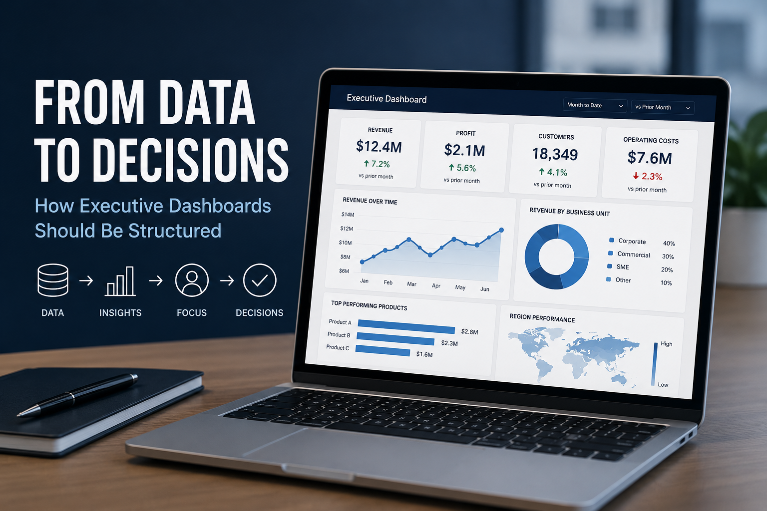
Executives rarely need more data. They need a clearer view of what the data is telling them, what has changed and where their attention is required. That distinction is important when designing an executive dashboard.
A common misconception is that businesses need perfectly organised, enterprise-grade data before they can benefit from AI. While strong data foundations certainly improve outcomes, perfection isn't the goal.
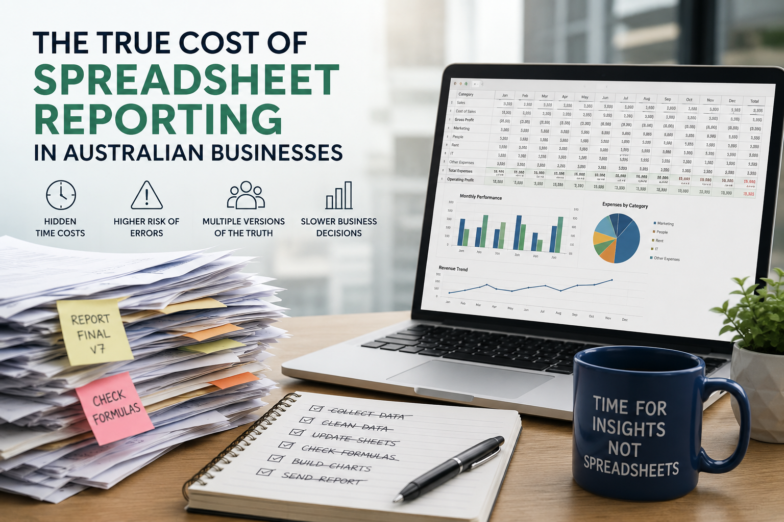
As businesses grow, spreadsheet reporting often becomes an expensive bottleneck that consumes valuable time, increases business risk and limits the ability to make informed decisions.
Learn how to use Power BI parameters to build dynamic, user-friendly dashboards. This guide covers Power Query, field, and what if parameters with practical use cases.
Power BI and Tableau are two of the most popular business intelligence tools, but which one suits your business best? We compare their usability, visualisation, data integration, report sharing, and pricing to help you make an informed choice.
Data storytelling is the art of translating raw data into a meaningful message, helping teams align, make decisions faster, and communicate insights more persuasively.
Compare AWS, Azure, and Google Cloud to find out which cloud platform offers the best tools, performance, and value for your analytics strategy.
Struggling with slow, cluttered, or confusing Power BI dashboards? Discover 10 common mistakes businesses make in Power BI—and how to avoid them to build faster, clearer, and more impactful reports.
Look back through our old articles using the search function. Key terms to use are “Power BI”, “Tableau”, “Qlik”, “dashboard” and “Visualisation”.
We have updated last years “test your skills” game with the 2021 results, so you can test your Melbourne Cup knowledge by (trying) to pick the winners from previous years…
Read MoreThe visualisation expresses the data by stacking two charts and using colour. The green part in the middle is the “Go Zone” - if we get contraction duration above 1 minute, time between less than 3 minutes, for about 1 hour, we head to the hospital!
Read MoreIf you’ve been to the airport lately, you’d know it’s a changed experience to years gone by due to COVID-19. Less buzz, more rules. But, is it possible there have been winners in aviation out of the pandemic? At White Box, we decided to dig a little deeper, and this is what the data told us.
Read MoreOn a recent journey to a client's office, one of us idly mentioned some tooth pain and a trip to the dentist in the offing. To our surprise, our taxi driver chipped in with some clearly expert questions on the topic of dentistry.
“Had some work done yourself?” we enquired.
“Not really,” he responded. “It’s that back home, I’m a dental nurse.”
Read MoreIf you follow cricket, you know that England’s recent form has set the test world on fire. How do you rate their achievements?
In anticipation of their series against South Africa starting this week, we’ve put together a data visualisation to determine just how highly we should be rating their recent achievements in the sport. Read on to compare notes.
Read More