
Bring your data to life
Data visualisation turns your data asset into the accessible high-impact reporting tool you’ve been searching for to make fast effective decisions every day. Empower your team with interactive real-time dashboards, while putting an end to emails laden with attachments.
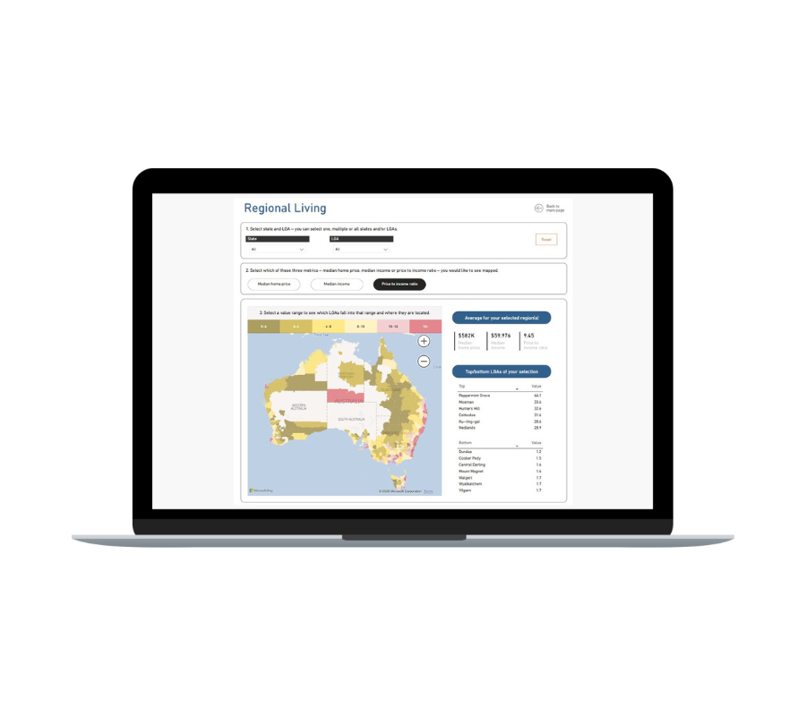
Whether with Power BI, Tableau, Looker Studio, or something else, with the guidance of White Box you’ll see your data like never before, gaining insights that will drive success with your stakeholders, investors, and customers.
Learn about our best practice data analytics and visualisation methodology.
Your partner in data visualisation


The problem
You want your data to translate into clear answers at your fingertips, but it takes time, energy and know-how. At least one of those is proving hard to come by.

The process
We’ve guided a multitude of companies like yours using our PROVEN FIVE STEP PROCESS that materialises your vision and needs. Transparent, efficient and effective.

The prize
Our clients feel liberated, then empowered; on top of their data asset. They are able to focus their attention on lighting the way forward instead of grappling with the past.
We can kickstart your journey
Is Power BI a strong contender? Or is Tableau a better overall picture? Maybe Qlik has piqued your interest?
Whether evaluating the many data visualisation tools in the market, or already committed to a product, getting on with it can be daunting. Together with White Box as trusted advisor, we can launch that rocket so you gain momentum and start getting value from your data-driven reports sooner than you think.
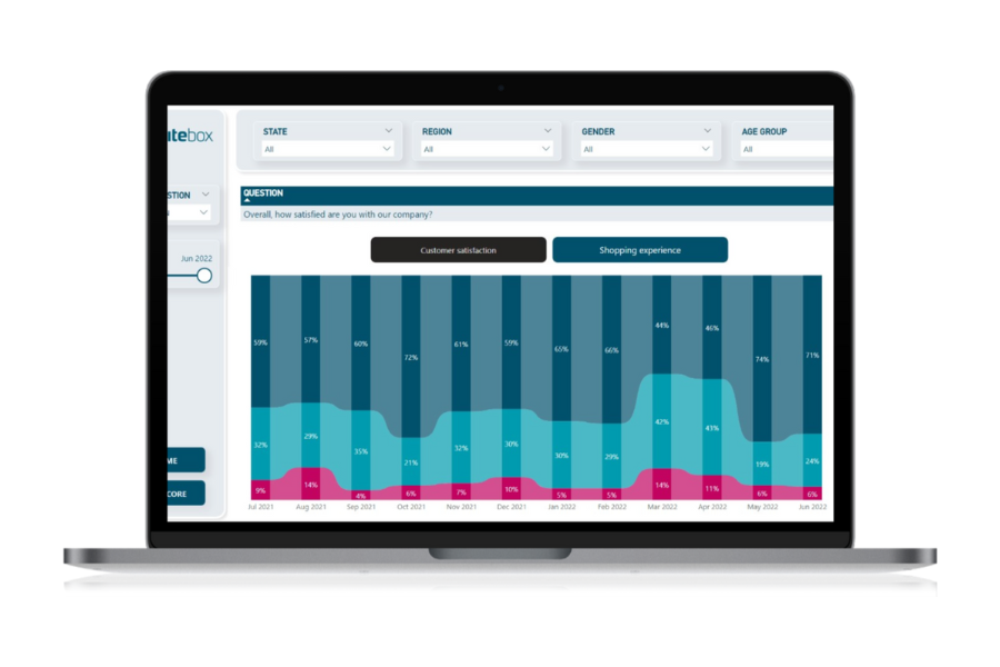
Featured Data Stories
At White Box, we’re passionate about data analysis & visualisation and we like to showcase this through our Data Stories.
Our blog posts cover diverse topics but all have data analysis and visualisation as the backbone to the thoughts and insights we uncover.


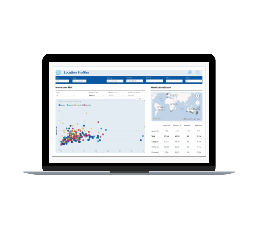
Read our customer success stories
At White Box we have helped hundreds of clients make better use of their data - from impactful dashboards to machine learning algorithms to predict churn.
These showcase our expertise in Power BI, Tableau, Qlik and Looker Studio as well as our deep understanding of SQL, R and Python.


Independent and agnostic
White Box is an independent company with years of experience working with clients and teams to improve their marketing, operations & financial functions in both Australia and the UK. We are agnostic to tools, so we find the best solution for you rather than pushing a partners software. With an agile business model, White Box can provide all levels of data analytics consultancy services with a team of experienced data analysts, data scientists and data engineers.
The White Box business was established to humanise data analytics for clients. By producing outputs which are not only insightful but can be implemented in strategy to generate powerful results straight away, White Box data analytics solutions give companies the edge over competitors for long-term success.