



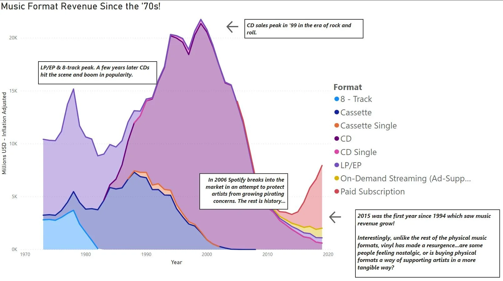
This Power BI visualisation shows music revenues generated by format since the 1970s. Simple expressions like this have powerful story telling abilities when the underlying data is understood and explored in more detail. Get in contact for help on analyzing your own data.
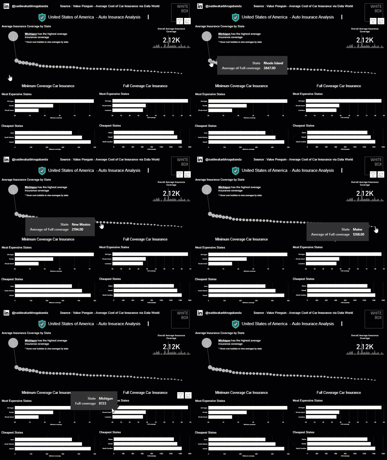
Read MoreThis visualisation showcases the cheapest and most expensive states for both minimum and full coverage car insurance in the US. The data is presented using Power BI which is becoming an increasingly popular tool among all businesses.
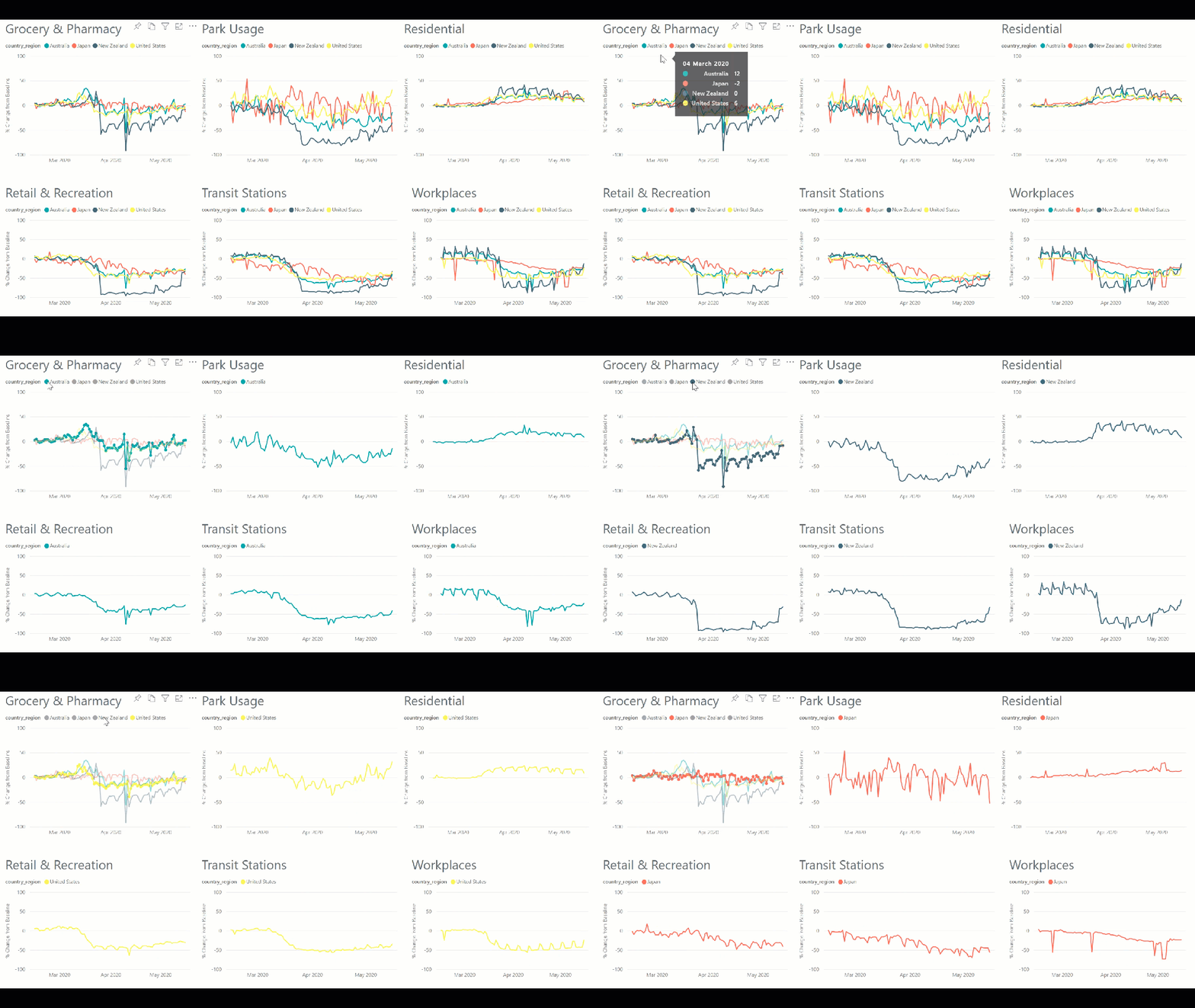
Read MoreOur team of data scientists have closely followed the latest Google Mobility Data in an attempt to match Nation wide policies on the movement of people with actual location data trends. Extracting data about all countries with available mobility data, we graph out the % change from the baseline of visitors to Grocery Stores and Pharmacies, Parks, Residences, Retail and Recreational Spaces, Transit Stations and Workplaces.
Read MoreThis visualisation showcases the cheapest and most expensive states for both minimum and full coverage car insurance in the US. The data is presented using Power BI which is becoming an increasingly popular tool among all businesses.
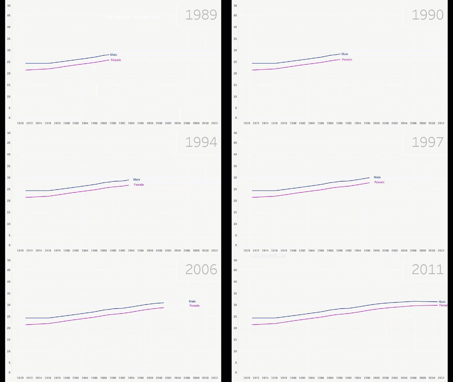
Read MoreIn this visualisation, Ije showcases one of the new Tableau features which allows for an interactive line chart to better visualise the trend present in the data. This particular visualisation explores the average Australian’s age when they get married, and how this changed between 1971 and 2011.
Read More