Dynamic axis for multi-view charts | Microsoft Power BI
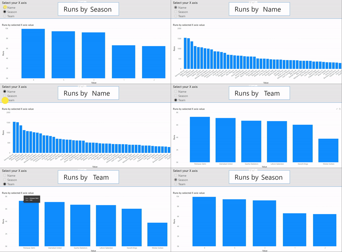
A sleek solution often used by the White Box team is to implement dynamic axis charts for our clients, particularly those in C-level and managerial positions who oversee many functions and operations at once.
Dynamic axis charts are a custom-built solution in Power BI which allow users to toggle between variables on either the X or Y axis of charts. The user can quickly jump between views, without having to jump between report tabs.
Read More
Data-Driven Notifications | Microsoft Power BI
Data-driven Power BI notifications are a great way to stay on top of the significant change events in your business.
This Power BI feature resolves that issue by allowing you to automate the triggering of notifications, via email or text, so you’re informed about these key changes as they happen.
Read More
Are you a digital transformation leader or laggard?
Digital transformation through data are becoming mandatory for all businesses. Are you leading the charge in the digital age for your business, or letting your competitors slip past you? Reach out today to discuss what a digital transformation could look like for your business.
Read More
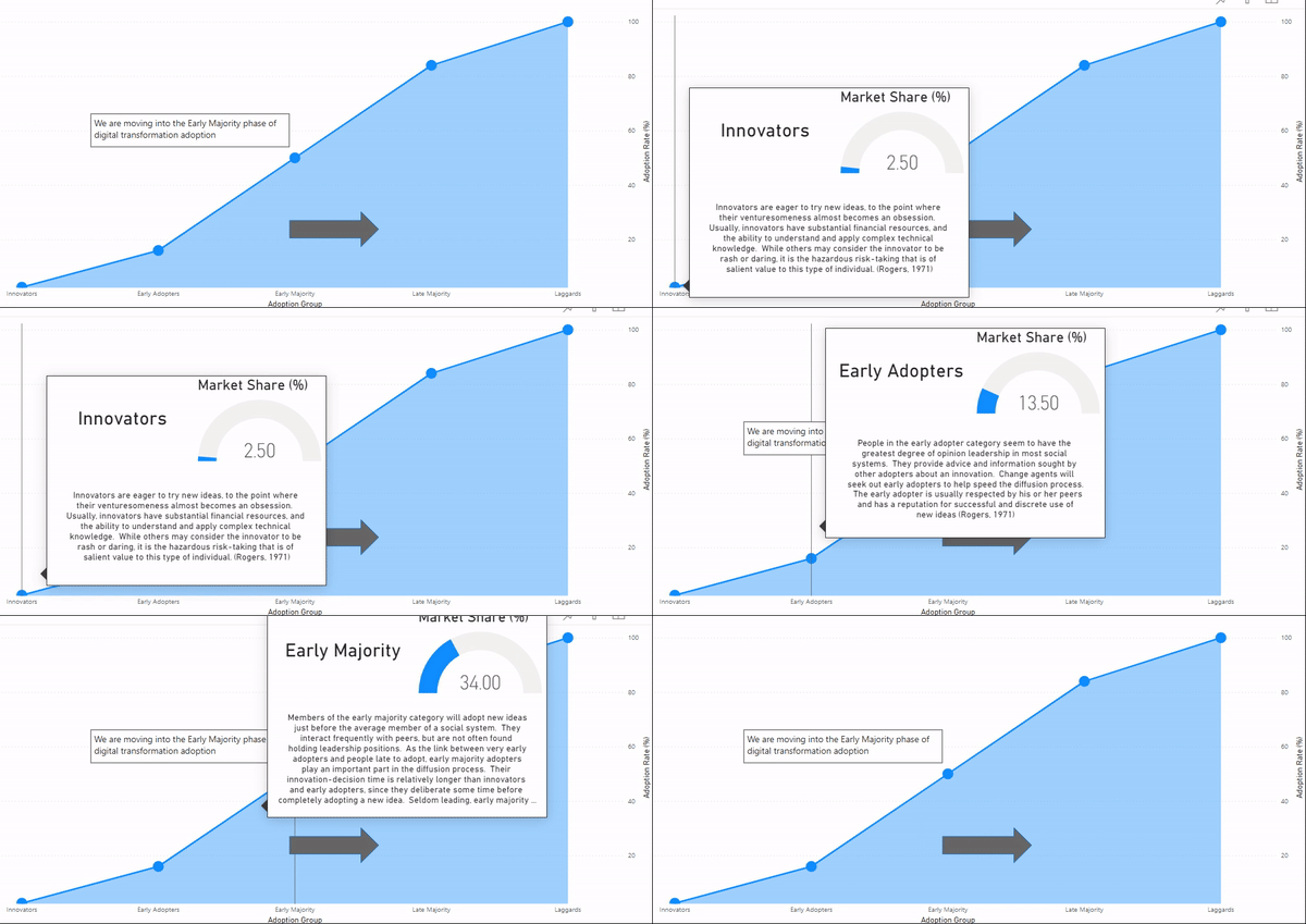
Visually Interactive Chart Cards - Power BI New Features Update
Tooltips are great for diving deeper into points of data to uncover hidden insights and stories which unlock business questions and can be turned into a basis for further action taking. Reach out to see how we can unlock beautiful truths from your data today.
Read More
The Australian Movie Industry! Celebrating our new office move...
Explore our Australian Movie Industry insights dashboard as we celebrate White Box’s office move and expansion to George Street in the CBD in the headquarters of EVENT Cinemas. The dashboard was built with Tableau and uses data from the Australian Government and The Numbers.
Read More