Data consultants
Home Customer Success Data stories Team Contact us
HomeCustomer SuccessData storiesTeamContact us
Data consultants

Read our regular blog on all things data

At White Box, we’re passionate about data analysis & visualisation and we like to showcase this through our Data Stories.

Our blog posts cover diverse topics but all have data analysis and visualisation as the backbone to the thoughts and insights we uncover.

Visualisation
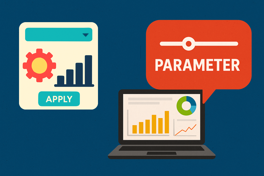
Unlock Dynamic Dashboards with Power BI Parameters
Jul 28, 2025
Unlock Dynamic Dashboards with Power BI Parameters
Jul 28, 2025
Jul 28, 2025
Power BI vs Tableau: Which Tool is Right for Your Business?
Jul 14, 2025
Power BI vs Tableau: Which Tool is Right for Your Business?
Jul 14, 2025
Jul 14, 2025
Storytelling with Data: Turning Numbers into Narratives
Jun 17, 2025
Storytelling with Data: Turning Numbers into Narratives
Jun 17, 2025
Jun 17, 2025
AWS vs. Azure vs. Google Cloud: Which Cloud Platform is Best for Analytics?
Jun 10, 2025
AWS vs. Azure vs. Google Cloud: Which Cloud Platform is Best for Analytics?
Jun 10, 2025
Jun 10, 2025
10 Common Power BI Mistakes and How to Avoid Them
May 8, 2025
10 Common Power BI Mistakes and How to Avoid Them
May 8, 2025
May 8, 2025
Power BI Paginated Reports vs. Standard Reports: When to Use Each
Apr 30, 2025
Power BI Paginated Reports vs. Standard Reports: When to Use Each
Apr 30, 2025
Apr 30, 2025
Power BI Row-Level Security: How to Control Data Access Effectively
Apr 8, 2025
Power BI Row-Level Security: How to Control Data Access Effectively
Apr 8, 2025
Apr 8, 2025
The Power of Geospatial Data Visualisation: Maps, Heatmaps, and More in Power BI
Apr 1, 2025
The Power of Geospatial Data Visualisation: Maps, Heatmaps, and More in Power BI
Apr 1, 2025
Apr 1, 2025

Search

Look back through our old articles using the search function. Key terms to use are “Power BI”, “Tableau”, “Qlik”, “dashboard” and “Visualisation”.


Our latest posts

Mind the gap: the disparity in gender pay goes on

We’re all aware that there is a gender pay gap but are certain areas more prone to it? We look at high earners across Australia using the 2021 Census data.

Read More
Data VisualisationGuest UserNovember 7, 2022census, gender pay gap, Tableau
Can you pick the Melbourne Cup winner...from last year?

We have updated last years “test your skills” game with the 2021 results, so you can test your Melbourne Cup knowledge by (trying) to pick the winners from previous years…

Read More
Data VisualisationLouis KeatingOctober 31, 2022melbourne cup
T20 World Cup: Cricket loves a rivalry, and a debate

The T20 Cricket World Cup is underway and was marked on Sunday by a sensational game between unyielding rivals India and Pakistan, with an epic finish that left everyone speechless.

Read More
Lachlan McKenzieOctober 25, 2022
In the beginning - there was data

The visualisation expresses the data by stacking two charts and using colour. The green part in the middle is the “Go Zone” - if we get contraction duration above 1 minute, time between less than 3 minutes, for about 1 hour, we head to the hospital!

Read More
Data VisualisationLouis KeatingOctober 11, 2022Life, birth, Tableau
Footy finals: the pain of second prize

Footy season is at an end 😪 but there’s time for data yet. Long may it reign!

Here’s a last look at the finals through the tears of the runners-up.

Read More
Lachlan McKenzieOctober 5, 2022Tableau
Newer Older
 
White Box Analytics Pty Limited
478 George Street,
Sydney, NSW, 2000,
Australia
+61415775733 team@whiteboxanalytics.com.au
Hours
Mon 9am - 5pm
Tue 9am - 5pm
Wed 9am - 5pm
Thu 9am - 5pm
Fri 9am - 5pm
Sydney data analytics companyFAQTerms of servicePrivacy policyContact us

ABN: 64622954054 - Contact: team@whiteboxanalytics.com.au

Location: 5 Martin Place, Sydney NSW 2000 - Phone: 0451767255