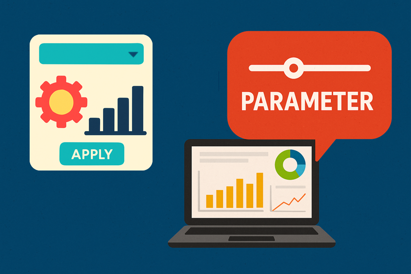
What is a White Box?
What is a white box white box data analytics sydney

One of the first things people ask us is what does White Box mean? What is a White Box? And to answer that, lets start with what it isn’t.

In data analytics, a black box is an output with no understanding of its inner workings. It’s kind of like when you’re trying to solve a complex problem, and somehow, you manage to get an answer, but you have no idea how you got there or what the answer means. Is that useful? Maybe if someone else knows what it means, but in most cases, without a fundamental understanding of the inner workings and processes, you’re no better off than when you started.

So, we finally get to the answer, which embodies what White Box represents as a business. A White Box occurs when the business understands the inputs and variables that contribute to the outcome. By developing a mature understanding of these factors, all businesses can better understand their data and use this understanding to improve their offerings, increase efficiencies and better measure and enhance the success of their operation.

If you feel like you’re struggling to find your White Box, send us a message, we work with a range of clients everyday, unlocking the potential of their data, and refining these findings into profitable solutions.

Or looking for more insights and visualisations? Check them out here.

CommentaryJack Sloman
Harmful Pesticide Usage in the US - Visualisation
 

This week we welcomed Sai Diwakar Bhrugubanda to the White Box team. Sai has kicked things off with an interesting visualisation on the usage of harmful pesticide ingredients in the United States, relative to their respective usage in other countries including China, Brazil as well as the continent of Europe.

Context

The United States of America (USA), European Union (EU), Brazil (BRA) and China (CHN) are the largest agricultural producers and users of agricultural pesticides in the world, accounting for more than 50% of all global agricultural production.

Comparing the inclination and ability of different regulatory agencies to ban or eliminate pesticides that have the most potential for harm to humans and the environment provides us with a glimpse into the effectiveness of each nation’s pesticide regulatory laws and oversight.

The Data Sample

Pesticide Action Network (PAN) International maintains a list of pesticides that are banned in various countries. However, because of drawbacks with the data the analysis was done independently of PAN international list. Despite this, many of the same sources were used.

The United States Geological Survey (USGA) National Water-Quality Assessment Project maintains an online resource of annual pesticide use estimates for all pesticides in USA agriculture from 1992 forward.

We proceeded to plot data points for a 25 year period, from 1992 - 2016, with the approval status of over 500 agricultural pesticides used in the USA compared with the number approved in the EU, Brazil and China.

Statistics

Comparing the list of 500 active pesticide ingredients used in agricultural application in the US since 1970, the following countries banned a large number of them:

  • Europe - 72 ingredients,

  • Brazil - 17 ingredients,

  • China - 11 ingredients ,

  • And at least one other country within the data set banned 85 ingredients.

Considering the great deal of banned ingredients among other countries compared to the US, the quantity of pesticide use is alarming - China being the greatest consumer whilst seemingly having the least stringent regulations on dangerous pesticides.


Consumption of Pesticides


More than 10% of the total pesticide use in the USA in 2016 was from pesticide ingredients either banned, not approved or of unknown status in Brazil, China and the EU, a huge figure considering the enormity of US agricultural production.

Discussion

Of the pesticides banned in at least two of these nations, many have been implicated in acute pesticide poisonings (poison exposure to a single dose / repeated small amounts of doses of pesticides) in the USA .

From 2000 – 2015 there were over 1000 pesticide illnesses in California alone (largest agriculture producing state by value), with up to 100 poisoning incidents in the USA each year.

Worryingly, there has been 1 death per year since 2012 as a result of pesticide poisonings. On top of this, from 1990 -2014, there were 27 deaths, as well as 22 high-severe and 181 moderate-severe cases of illness.

Specifically, the National Indicate for occupational safety and health indicate between 1998 and 2011 – 43% of insecticide related illness in the USA involved cholinesterase.

Over 45 million pounds of agriculture pesticide use in the USA comes from the 13 pesticide that are banned or in the process of being phased out in at least two of the three other agricultural nations.

However 10 of the 13 are either banned, being phased out, not approved of unknown status in all three.

Conclusion

Total pesticide bans remain the most effective way to prevent intentional or accidental exposure to highly hazardous pesticides and can catalyse the transition to safer alternatives . Surprisingly, the USA is lagging when it comes to banning or phasing out pesticides that the top agricultural powers have identified as too harmful for use.

This is likely due to deficiencies in pesticide legislation in the USA. FIFRA gives the US EPA significant discretion on which pesticides it ultimately decides to cancel and makes the US EPA-initiated, non-voluntary cancellation process particularly onerous and politically fraught. This, in part, has led to an almost exclusive reliance on industry-initiated, voluntary cancellation of pesticides in the USA.

Without a change in the US EPA’s current reliance on voluntary mechanisms for pesticide cancellations, the USA will likely lag behind its peers in banning these harmful pesticides. Recent mitigation measures finalized by the US EPA, which include warning labels, extra training requirements and safer packaging standards that are fully supported by the pesticide industry, indicate that voluntary mitigations will likely be used in lieu of cancellations for at least some of these dangerous pesticides in the future.


This visualisation was created by Sai Diwakar Bhrugubanda.

For more fascinating visualisations and data stories, click here.

To keep up with all things data and White Box, follow us on our LinkedIn page.

 
VisualiseJack Sloman
The man who got rich on data - years before Google - Article Analysis
how data analysis developed into the booming industry it is today
 

The man who got rich on data - years before Google is a time-lined walk-through of how a man called Herman Hollerith came across a flawed process, that being the government’s ability to capture, sort and derive value from increasing amounts of census data, and came up with a solution that has changed the landscape of the modern economy forever.

In 1880 Hollerith developed the first tabulating machines which were first used in the 1890 census, saving millions of dollars and enabling the government to discover far more powerful insights from the information it was capturing.

The backbone of the story is based around the common and now frequently used saying in data related content: data is the new oil. Harford both agrees and disagrees with this statement. Data is like oil in that when it is crude and unrefined, it isn’t of much use to anyone. However, once it is refined, unlike oil, data can be used more than once to power whatever it is being used for.

He attributes this fact to the reason why tech companies like Alphabet, Alibaba, Amazon, Facebook and Tencent have grown to become 5 of the 10 biggest companies in the world, which was once dominated by oil companies. The way these companies have achieved success is dissimilar to that of Hollerith’s Tabulating Machine Company, which eventually went on the become IBM. This is because we now produce data in everything we do, meaning that compared to the 1890s and early 1900s where data was produced in much stricter and refinable formats, the most successful businesses are the ones who know and understand what data is valuable, and why.

Now we know this is much easier said than done, but is the reason we believe all companies who want to remain competitive over the next year and next decade need to carefully consider whether their data refining systems are producing outputs that drive effective decision making.

In essence, what’s the point of having a data strategy if the data strategy isn’t giving you outputs that create value for your business and customers?

Check out the original story here.

For more data analysis and visualisations, click here.

Or, get in touch for a discussion about your data strategy.

 
Data is the new oil. But is it really?
Data is much more complex and is constantly being used for different purposes
CommentaryLouis Keating
How to run a LinkedIn Advertising Campaign - Our Experience

Upon our completion of the Sydney Lock-Out Laws impact analysis, we decided the findings would probably be of interest to more than just our immediate page followers. So we thought what better way to share our insights with the greater Sydney population than to run a LinkedIn Advertising campaign to get exposure for the findings, to encourage engagement with the outcomes of the laws, and to ultimately test the waters with the advertising platform to see just how sticky LinkedIn advertising really is.

Objective of the campaign

Our objective for this campaign was to build a broader following for the White Box brand across Australia (with a focus on the Sydney market).

How we did it

We created an easily digestible info-mercial of our key findings of our analysis piece which complimented LinkedIn’s formatting/feed styles and gave people the choice to engage with the story in their own way.

What we did

The campaign budget was spread over a 10 day period and launched on Tuesday 3rd December, following the mayhem that was the Black Friday and Cyber Monday weekend sales.

As the period included non-business days of Saturday 7th and Sunday 8th December, we allocated the daily budget limits to an amount slightly greater than the total budget divided by the number of days it would be active, with the intention to let LinkedIn role out the ad more to groups who were engaging and to not limit this engagement (too much) as a result of the budget. We’ll discuss the outcome of this strategy below.

The LinkedIn Campaign Manager - Objectives and Audience

LinkedIn, supposedly, is the ‘stickiest’ platform for ads in terms of engagement for a number of reasons including and definitely not limited to:

  • compared to Facebook and Instagram, its users are far more likely to keep their employment details up-to-date, meaning targeting specific businesses or job titles is far more accurate

  • like Facebook and Google, you can add insight tags to better capture target audiences and those who have engaged with your ad and website to refine future targeting efforts

  • LinkedIn is a professional network with users inherently more aligned with our business and its offerings than users interacting on purely social platforms

Prior concerns, issues and thoughts surrounding the campaign

For this campaign, our main aims were not to ‘sell’, ‘convert’, or any of the other key buzz words you’d expect to see when reading a post on advertising. This is because we first want to find an audience that values our brand and business solutions, rather than push sales messages into the open and hope something sticks.

As such, we used the ad as a way to engage the wider Sydney professional network in order to establish industries, businesses and people who are more likely in our target market and (hopefully!) more willing to engage in with our business and content.

The live campaign featured a carousel of images walking the audience through the analysis and its core findings

The live campaign featured a carousel of images walking the audience through the analysis and its core findings

Analysis of Results

There was a lot to take away from this campaign, and overly, we believe it was successful. It could definitely however use further tweaking and optimisation - we’ll discuss all of these factors now.

Clicks.png

Overly, the campaign reached a large audience and increased our follower count by over 35%. Although we didn’t have a specific number of followers we were aiming for this time around, based on the budget and the amount of exposure we received from the campaign, this acts as a great basis point for future campaigns whilst allowing us to understand the capabilities of LinkedIn ad campaigns.

A shortcoming of the LinkedIn campaign manager however does exist for analysing these metrics, and that is that it doesn’t seem to be great at determining and reporting which followers were gained through the ad, and which were organic. Hopefully this will be fixed in due time.

Cost Per Click LinkedIn Advertising.png

Secondly, as you have probably now noticed in the above graphs, the campaign didn’t receive clicks on the launch date, or for the final three days we had intended. We put this down to two reasons:

  1. it takes a bit of time for the campaign to find and get pushed out by LinkedIn into the feeds of the target market

  2. If LinkedIn find target markets who are engaging with the content on any specific day, they will continue to push it until the budget for that day is exhausted - hence our budget allocation strategy we discussed earlier was flawed as LinkedIn found enough people each day to exhaust the daily spend limit.

Despite the campaign being live for a shorter period than we intended, there were other wins gained!

Interestingly, aside from the days of the weekend, the average click through rate increased from approximately 2.3% on the first day of audience engagement, to 3.8% at its highest point.

This suggests that as campaigns spend more time live, LinkedIn get better at finding appropriate audiences which are more likely to engage with your content. As these audiences are saved in your campaign history for future use, this is definitely a win in our books!

Click through rate linkedincampaigns how to data analysis advertise

Now the question remains, with more ad spend and/or a longer time period for tuning, could we achieve an even higher Click Through Rate? As we move deeper into the marketing funnel, our targeting will definitely need to be more refined, but this campaign has definitely been a great tester to see the potential that lies on the LinkedIn platform.

We’d love to hear your thoughts about LinkedIn advertising as well as the Sydney lock-out laws. To join the discussion, find us on LinkedIn.

CommentaryJack Sloman
The best Christmas movie

One of the joys of Christmas is movie watching and without doubt, I’ll have the same conversation I do every year when I dutifully select Die Hard for everyone’s viewing pleasure and someone will say “but this isn’t a Christmas movie?”.

So, I was excited to see an article by the blogger Stephen Follows (a film researcher with a love for data) that goes into extensive detail to test what a Christmas movie is by using data. So what better way to spend some pre Christmas party drinking time than to brush up your defence for putting on what I’ve titled above, is the best Christmas movie.

Die Hard analysis_1.JPG

He breaks down his analysis into understanding the creative elements, the commercial strategy and the cultural impact. There is a lot here, so I’ve pulled out some highlights for your ammunition.

What I like about this analysis is the diversity of the data Stephen has found, from looking at the above video analysis, the prevalence of Christmas songs within Christmas movies to the spread of Wikipedia pages views by month (December being the key indicator, see below).

Die Hard analysis_2.JPG
Die Hard analysis_2_3.JPG

He finishes with Google Trends and takes the time to annotate the peaks, which again indicate the Christmasness of Die Hard.

One of my favourite quotes to take from this from one of the two credited writers of the film, Steven de Souza has publicly declared “If ‘Die Hard’ is not a Christmas movie, then ‘White Christmas’ is not a Christmas movie”:

Unlike White Christmas, Die Hard took place entirely at Christmas, featured a Christmas party and the “Christ-like sacrifice” of John McClane walking on broken glass.

Hope you enjoy watching Die Hard at Christmas and please take time to read the original article here.

For more data analysis and visualisations, click here.

Or, get in touch for a discussion about your data strategy.

CommentaryLouis Keating