


This visualisation showcases the cheapest and most expensive states for both minimum and full coverage car insurance in the US. The data is presented using Power BI which is becoming an increasingly popular tool among all businesses.
Read MoreAt White Box, we’re passionate about data analysis & visualisation and we like to showcase this through our Data Stories.
Our blog posts cover diverse topics but all have data analysis and visualisation as the backbone to the thoughts and insights we uncover.
Look back through our old articles using the search function. Key terms to use are “Power BI”, “Tableau”, “Qlik”, “dashboard” and “Visualisation”.
This visualisation showcases the cheapest and most expensive states for both minimum and full coverage car insurance in the US. The data is presented using Power BI which is becoming an increasingly popular tool among all businesses.
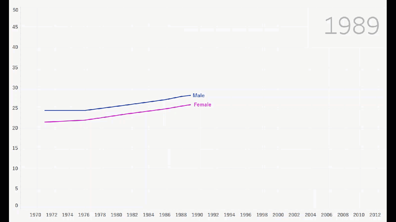
Read MoreIn this visualisation, Ije showcases one of the new Tableau features which allows for an interactive line chart to better visualise the trend present in the data. This particular visualisation explores the average Australian’s age when they get married, and how this changed between 1971 and 2011.
Read MoreDuring his time before arriving at White Box, Senior Data Scientist Mohamed Shakir worked on a number of groundbreaking projects. Integrating technology, data science and machine learning Mohamed produced an embedded wearable system that uses Electroencephalography to detect the signs of pre-seizure.
Read MoreIn Madagascar, Africa where particularly young women suffer from obstetric fistulas, rendering their child births agonizingly painful, and often leading to the loss of their babies. Operation Fistula aims to stop obstetric fistulas for all women, worldwide.
Read MoreDashboards are all about discovering insights from your data that you almost always cannot find by simply eye-balling it. Here are some of the top insights from our Top Rugby Players dashboard.
Read More