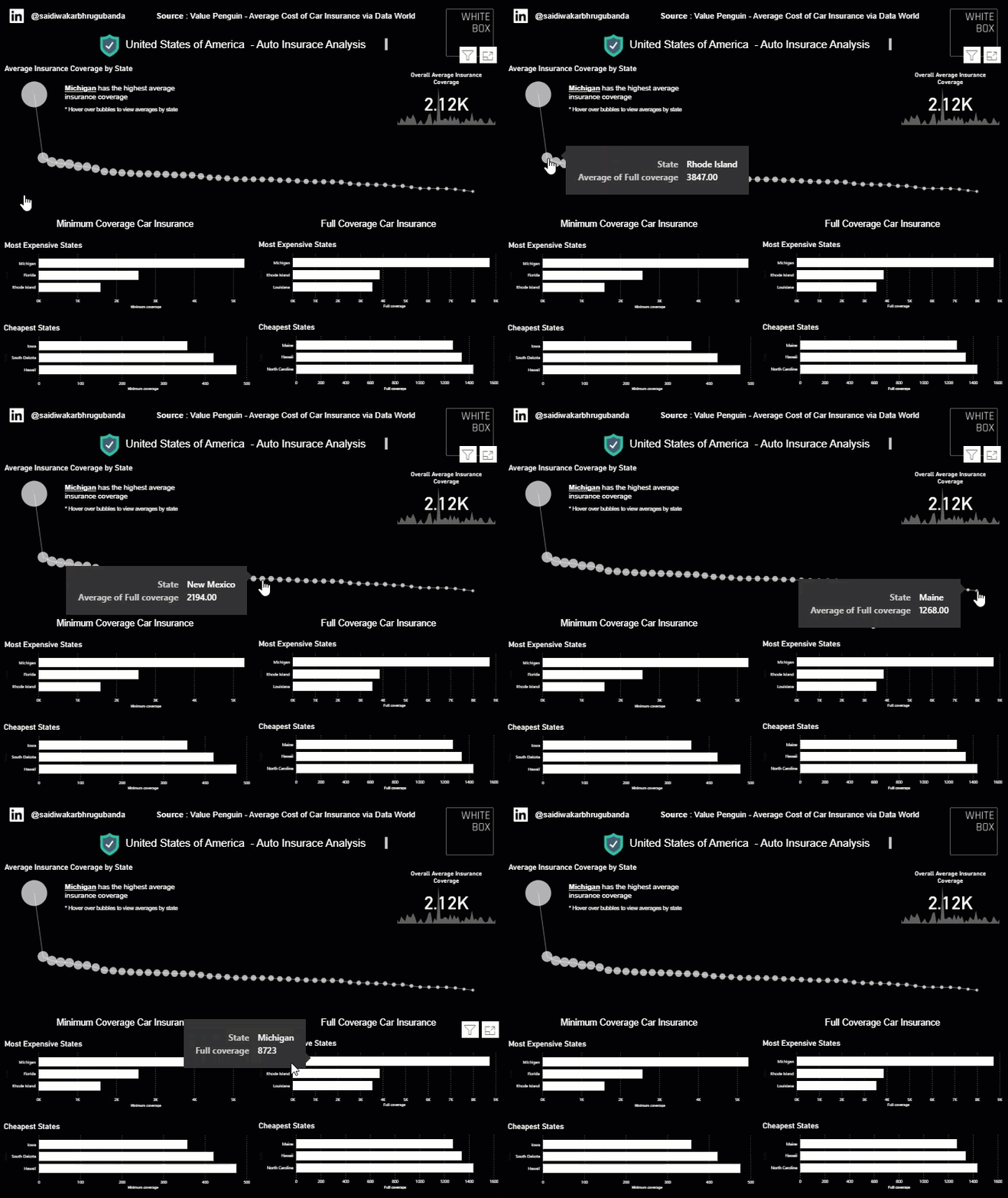



This visualisation showcases the cheapest and most expensive states for both minimum and full coverage car insurance in the US. The data is presented using Power BI which is becoming an increasingly popular tool among all businesses.
Read More
At White Box, we’re passionate about data analysis & visualisation and we like to showcase this through our Data Stories.
Our blog posts cover diverse topics but all have data analysis and visualisation as the backbone to the thoughts and insights we uncover.
A common misconception is that businesses need perfectly organised, enterprise-grade data before they can benefit from AI. While strong data foundations certainly improve outcomes, perfection isn't the goal.
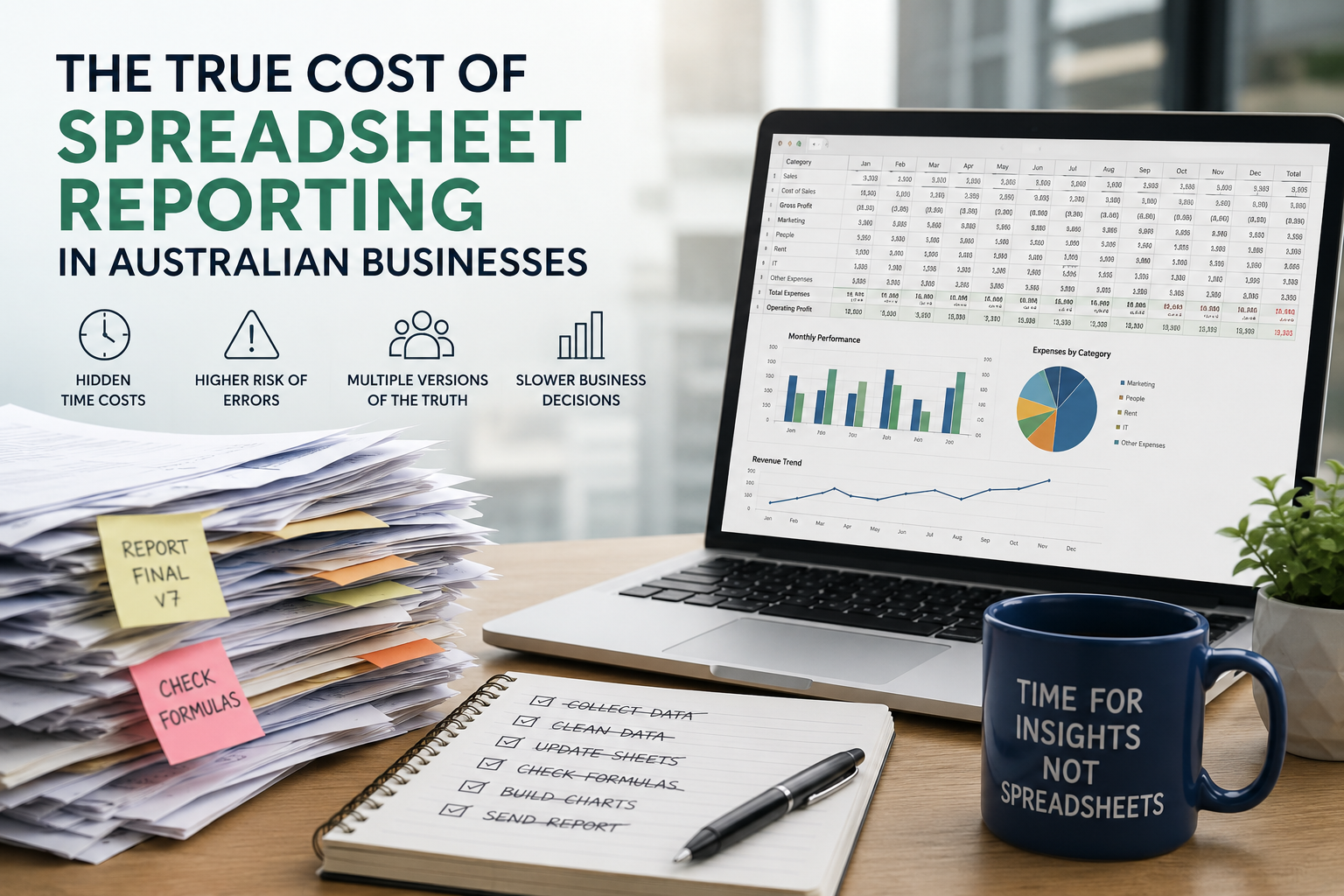
As businesses grow, spreadsheet reporting often becomes an expensive bottleneck that consumes valuable time, increases business risk and limits the ability to make informed decisions.
Learn how to use Power BI parameters to build dynamic, user-friendly dashboards. This guide covers Power Query, field, and what if parameters with practical use cases.
Power BI and Tableau are two of the most popular business intelligence tools, but which one suits your business best? We compare their usability, visualisation, data integration, report sharing, and pricing to help you make an informed choice.
Data storytelling is the art of translating raw data into a meaningful message, helping teams align, make decisions faster, and communicate insights more persuasively.
Compare AWS, Azure, and Google Cloud to find out which cloud platform offers the best tools, performance, and value for your analytics strategy.
Struggling with slow, cluttered, or confusing Power BI dashboards? Discover 10 common mistakes businesses make in Power BI—and how to avoid them to build faster, clearer, and more impactful reports.
Learn when to use Power BI Paginated Reports versus Standard Reports to deliver insights in the right format for your business needs.
Look back through our old articles using the search function. Key terms to use are “Power BI”, “Tableau”, “Qlik”, “dashboard” and “Visualisation”.
This visualisation showcases the cheapest and most expensive states for both minimum and full coverage car insurance in the US. The data is presented using Power BI which is becoming an increasingly popular tool among all businesses.
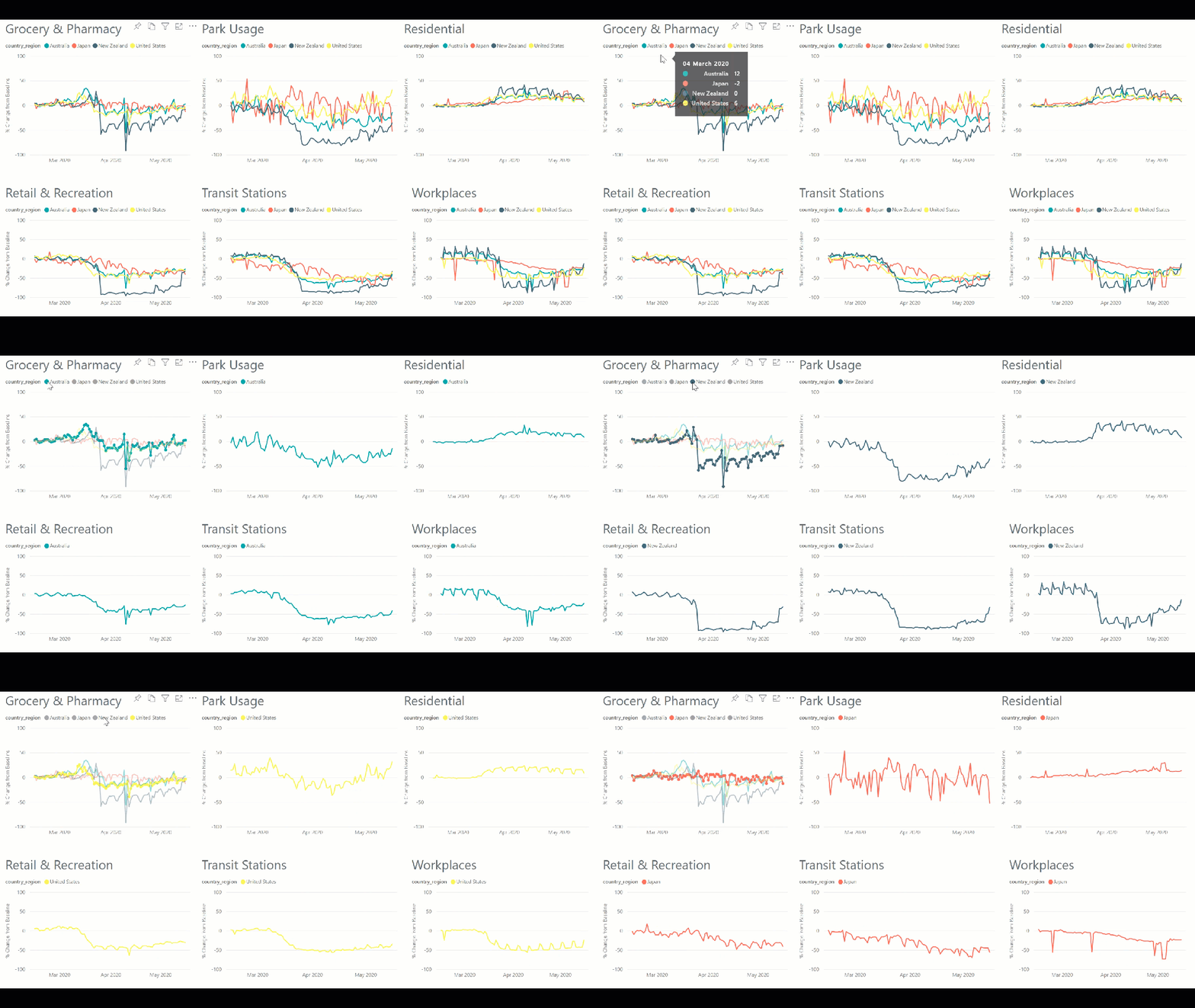
Read MoreOur team of data scientists have closely followed the latest Google Mobility Data in an attempt to match Nation wide policies on the movement of people with actual location data trends. Extracting data about all countries with available mobility data, we graph out the % change from the baseline of visitors to Grocery Stores and Pharmacies, Parks, Residences, Retail and Recreational Spaces, Transit Stations and Workplaces.
Read MoreThis visualisation showcases the cheapest and most expensive states for both minimum and full coverage car insurance in the US. The data is presented using Power BI which is becoming an increasingly popular tool among all businesses.
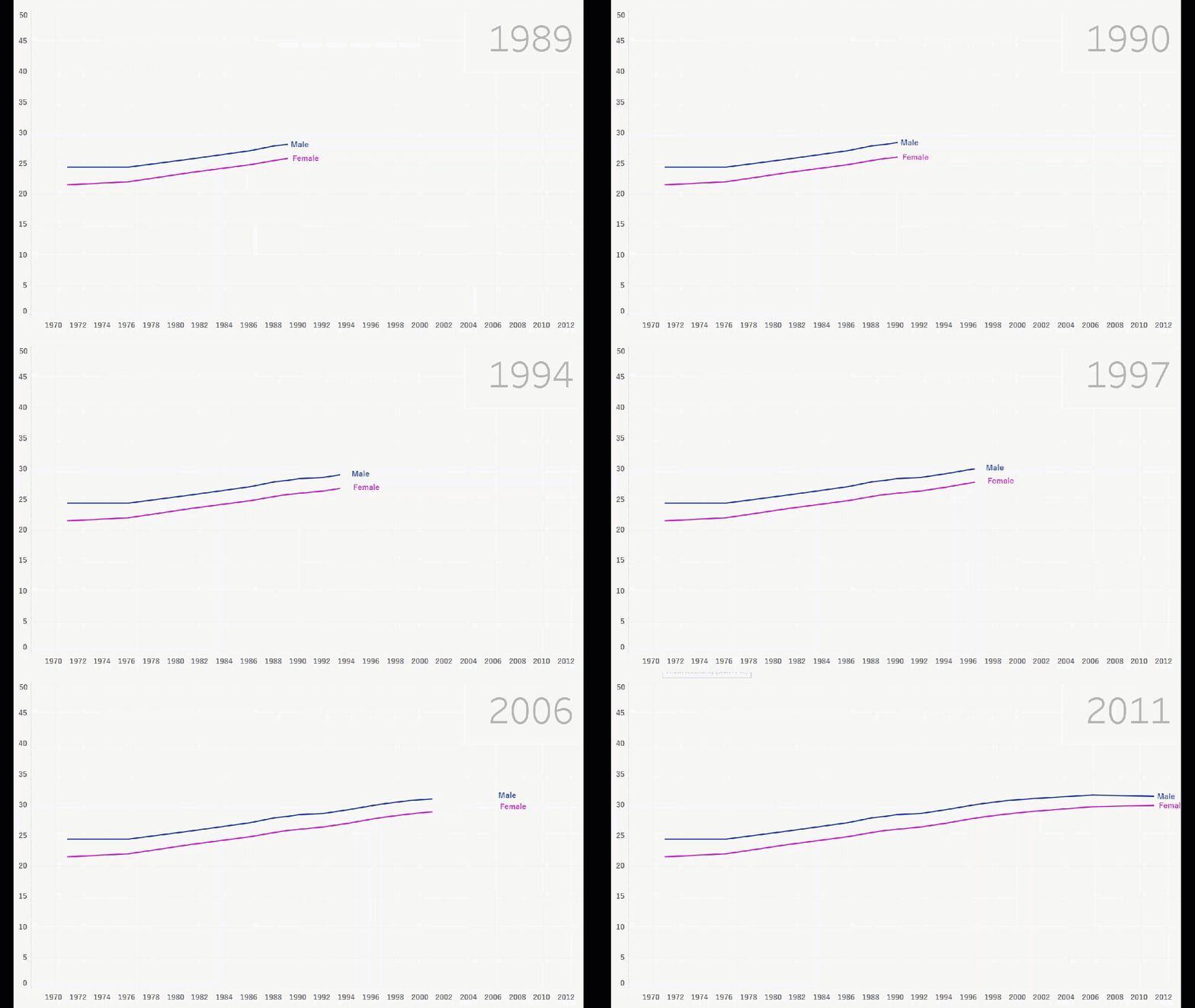
Read MoreIn this visualisation, Ije showcases one of the new Tableau features which allows for an interactive line chart to better visualise the trend present in the data. This particular visualisation explores the average Australian’s age when they get married, and how this changed between 1971 and 2011.
Read MoreDuring his time before arriving at White Box, Senior Data Scientist Mohamed Shakir worked on a number of groundbreaking projects. Integrating technology, data science and machine learning Mohamed produced an embedded wearable system that uses Electroencephalography to detect the signs of pre-seizure.
Read More