


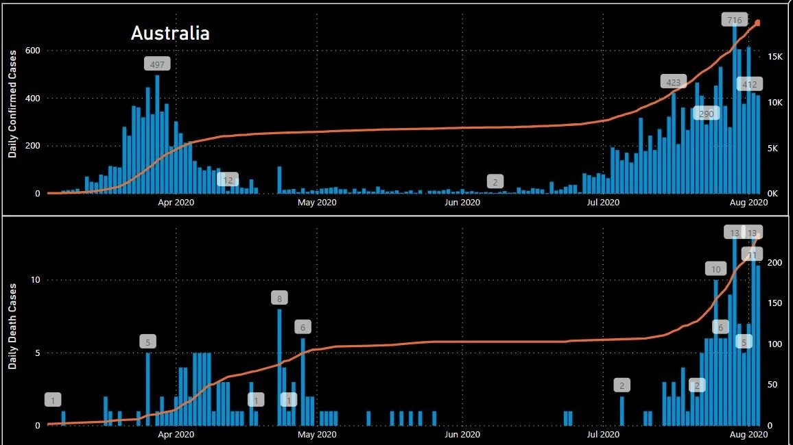
This analysis explores state by state occurrences of coronavirus and attempts to identify a relationship between the numbers we are seeing in Victoria with Mobiltiy Data related to the states populations movements.
Read More
At White Box, we’re passionate about data analysis & visualisation and we like to showcase this through our Data Stories.
Our blog posts cover diverse topics but all have data analysis and visualisation as the backbone to the thoughts and insights we uncover.
A common misconception is that businesses need perfectly organised, enterprise-grade data before they can benefit from AI. While strong data foundations certainly improve outcomes, perfection isn't the goal.
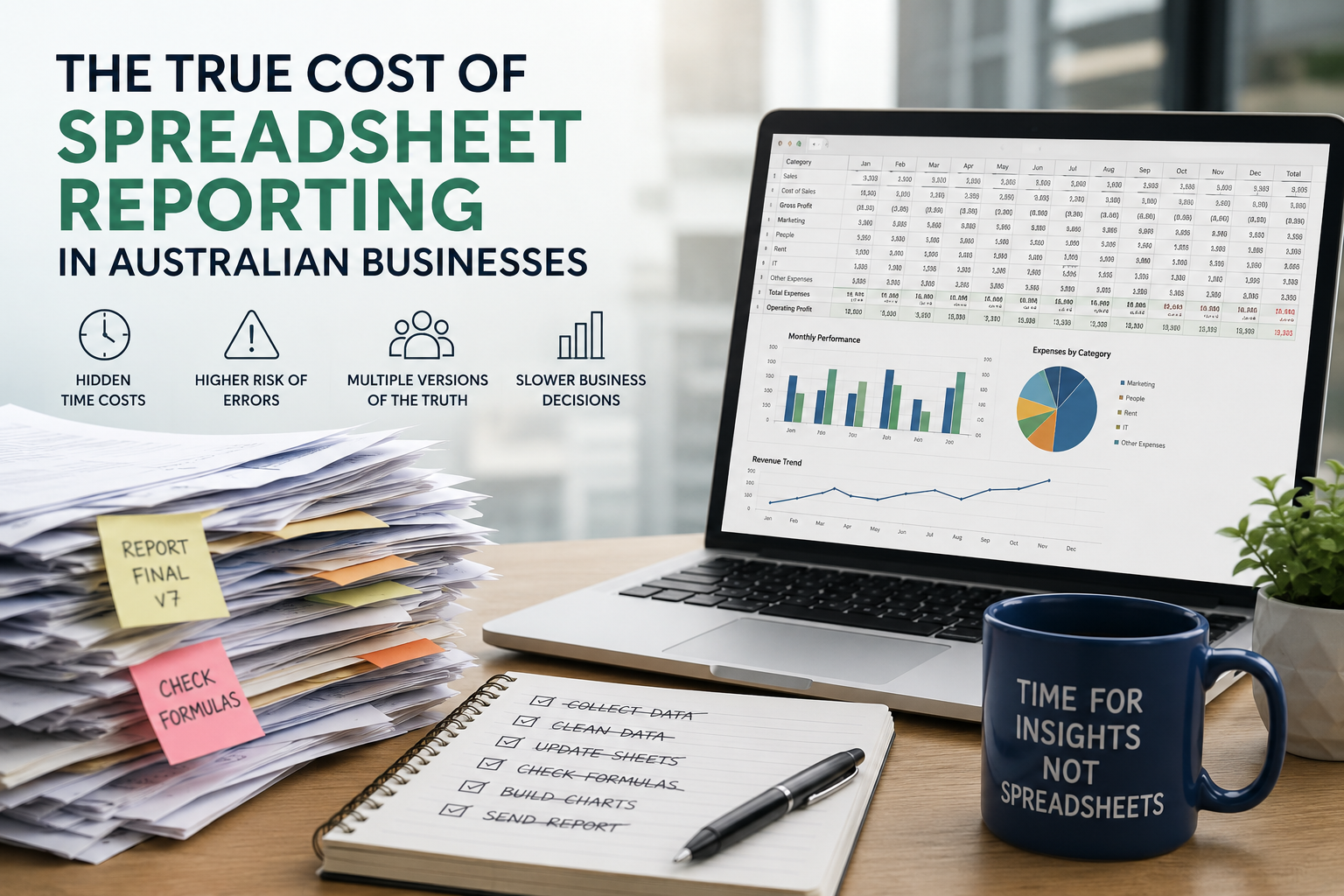
As businesses grow, spreadsheet reporting often becomes an expensive bottleneck that consumes valuable time, increases business risk and limits the ability to make informed decisions.
Learn how to use Power BI parameters to build dynamic, user-friendly dashboards. This guide covers Power Query, field, and what if parameters with practical use cases.
Power BI and Tableau are two of the most popular business intelligence tools, but which one suits your business best? We compare their usability, visualisation, data integration, report sharing, and pricing to help you make an informed choice.
Data storytelling is the art of translating raw data into a meaningful message, helping teams align, make decisions faster, and communicate insights more persuasively.
Compare AWS, Azure, and Google Cloud to find out which cloud platform offers the best tools, performance, and value for your analytics strategy.
Struggling with slow, cluttered, or confusing Power BI dashboards? Discover 10 common mistakes businesses make in Power BI—and how to avoid them to build faster, clearer, and more impactful reports.
Learn when to use Power BI Paginated Reports versus Standard Reports to deliver insights in the right format for your business needs.
Look back through our old articles using the search function. Key terms to use are “Power BI”, “Tableau”, “Qlik”, “dashboard” and “Visualisation”.
This analysis explores state by state occurrences of coronavirus and attempts to identify a relationship between the numbers we are seeing in Victoria with Mobiltiy Data related to the states populations movements.
Read MoreThis tableau visualisation explores the rise of women’s soccer in the US since 2003. A great visual display of the upward trend which has presumably been a strong influence in the success of the US women’s soccer team in recent global campaigns, including their win in the FIFA World Cup.
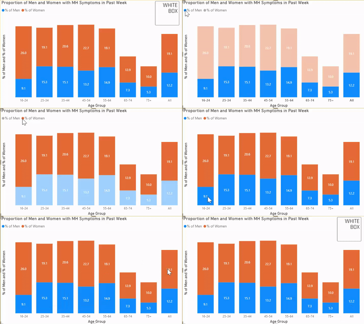
Read MoreWe use Tableau and Power BI to tackle a Makeover Monday data set on UK mental health statistics, incorporating figures from the original BBC article to draw out an interesting narrative. Telling stories with data is important for all businesses as it can highlight interesting insights and unlock new pockets of knowledge.
Read MoreA data silo is data that is stored in an individual or lone database, whether that be a website or cloud-based service, that is not integrated or understood in the context of the entirety of a businesses operation or available data sources. This makes it extremely difficult to understand the full picture when it comes to customer interactions with a company, and can lead to inefficient and/or ineffective strategy.
Read MoreHow can we measure the effectiveness of government lock-down restrictions across the globe in reducing outbreaks of the Covid-19 pandemic. We discover the effectiveness of individual nations’ lockdown restriction success by comparing global mobility trends with Covid-19 case numbers, utilising tools including Snowflake, Power BI and Excel which should be staples in any modern businesses data analysis.
Read More