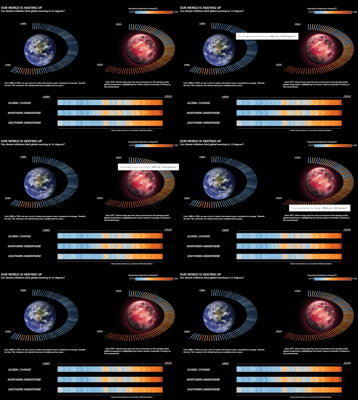
Our changing climate - Tableau visualisation
November has seen our world leaders gather for the 2021 United Nations Climate Change Conference. The aim of the conference is to establish a global commitment to curb rising temperatures in order to prevent a climate disaster.
This visualisation uses a dataset from the Tableau Monday Makeover series to understand average temperature deviations from the corresponding 1951-1980 means.
Read More
Why data analytics partnerships work - our experience
In this article, we discuss why a longer-termed, more balanced data strategy investment will often pay-off more than a shorter-term, quick-win based approach.
Read More
How data discovery can prevent you from falling in the 85%
85% of data projects fail. This article discusses some core reasons data projects fail, and how White Box has developed its ways of working to protect clients from falling into this trap by laying the foundations for successful solution implementation.
Read More
Churn modelling to understand and keep your best customers
It costs 5x more to attract a new customer than to keep an existing one. So it’s imperative that businesses have an eye on their churning customers, to ease acquisition costs and hold on to the value provided by loyal customers. This article explains the value of developing a churn model to manage these key business needs.
Read More
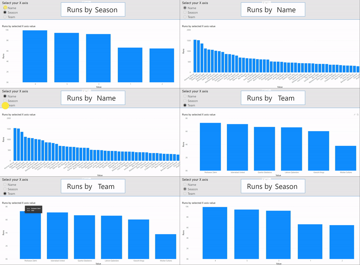
Dynamic axis for multi-view charts | Microsoft Power BI
A sleek solution often used by the White Box team is to implement dynamic axis charts for our clients, particularly those in C-level and managerial positions who oversee many functions and operations at once.
Dynamic axis charts are a custom-built solution in Power BI which allow users to toggle between variables on either the X or Y axis of charts. The user can quickly jump between views, without having to jump between report tabs.
Read More