How to use interactive image dashboards in Power BI to gain deep business insights

Power BI is a powerful software platform that enables businesses to visualise data and gain valuable insights for decision making. Through Power BI, you can create personalised reports and interactive dashboards that provide your team with a complete picture of what’s working – and as importantly, what’s not working – for your organisation.
Have a quick look at one we have designed here:
See how, by clicking around, you can gather the information that’s tailored to your organisation’s floorplan? It’s user-friendly and fast.
However, while this may sound promising, it takes a certain level of expertise to unlock the full potential of Power BI.
Integrating key data sources can be quite complicated, and the interactive dashboard can appear confusing or abstract to those inputting and using the data.
At White Box, we have an experienced team building comprehensive dashboard solutions like the one above. That’s how we help businesses like yours bring data to life with Power BI using our specialist technical and visualisation capabilities.
Let’s break down how we can optimise Power BI to benefit your organisation.
Maximising Power BI for deeper insights
Through data visualisation, you can transform complicated data sets into easy-to-understand insights, allowing you to effectively identify and communicate patterns, trends and outliers.
Our team at White Box understands this process well, allowing us to help businesses across all industries and sizes to build their data visualisation using tools such as Power BI and Tableau, which are powered by data engineering solutions made in Snowflake, SQL server, AWS, Python, R and even using advanced Microsoft Excel.
The example above was a replica of one we actually created, that we have de-identified and filled with generic data – as a showcase.
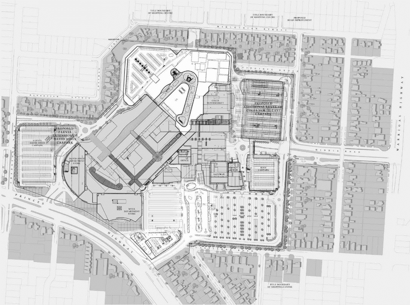
This client owns commercial properties across Australia and approached us for help in gaining clearer, more accessible and user-friendly insights. Their business operates with diverse data sets, such as tenant lease amounts, parking space capacities, organisational floorplans and individual shop area sizes, all of which update daily.
The client’s team was already using Power BI for various purposes, but now they were looking to use it to generate reports that could visualise their floorplan and make their data more engaging for both technical and non-technical users.
On their own, they were able to develop a simple, static data model. However, with the help of our experts at White Box, they now have a powerful and interactive dashboard that takes full advantage of the potential of Power BI.
Building the Power BI solution
Power BI alone does not provide any functionality to work or interact with an image.
However, White Box was able to bring the dashboard to life using a Microsoft-certified custom visual tool that enables images, floorplans and geographical maps to interact with Power BI reports.
Through this, we were able to build to our client’s requirements in making their mapping interactive. We made it possible to highlight each area of a floorplan to display the relevant pieces of information related to that space.
To make this work, our team had to use rigorous data cleansing and matching rules to ensure that the image matched the relevant data source entries. Through our expertise, we were able to draw on the potential of Power BI to provide this client with the ability to obtain various data outputs and comprehensive insights simply by clicking on the predefined areas of an image.
An interactive dashboard for more accessible data - fast
White Box successfully applied image interaction into Power BI to enable our client to gather the insights they required in a simple and efficient visual format.
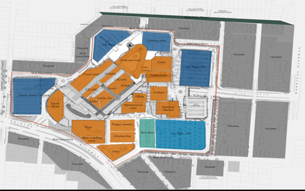
Below, we have reproduced a similar dashboard to showcase the results we were able to achieve for our client.
As you can see, this dashboard represents a shopping centre layout that allows the user to highlight different areas (stores) within the floorplan. Live data related to each store’s location, lease amount, lease period and floor space is made available as the user interacts with the image.
Please note: all data is purely for demonstration purposes only and is in no way related to our client’s organisation.
Using this interactive dashboard, it’s now easier to manifest and understand the diverse data relevant to this building.
For instance, the information can be categorised to easily determine insights such as:
which tenants have outstanding payments
what floor space is being underutilised
what sections of the centre have been assigned to each specific retail type
the revenue-generating potential of each square metre
past and expected rental income per tenant
All of this information being available in a few clicks makes it easier for management to simply open up the platform and make well-informed decisions.
At White Box, we can create these tailored dashboards for your business to help make sense of your data through the power of visualisation.
We can help you make data-driven decisions with user-friendly dashboards
White Box is highly experienced in providing data strategy, data science and data visualisation solutions.
As your Power BI consultant, we’ll help you to realise the full potential of your data and maximise your business success through advanced and innovative dashboards that make all the difference.
Get in touch today for your free data strategy consultation.
Explore more of our data stories:


