




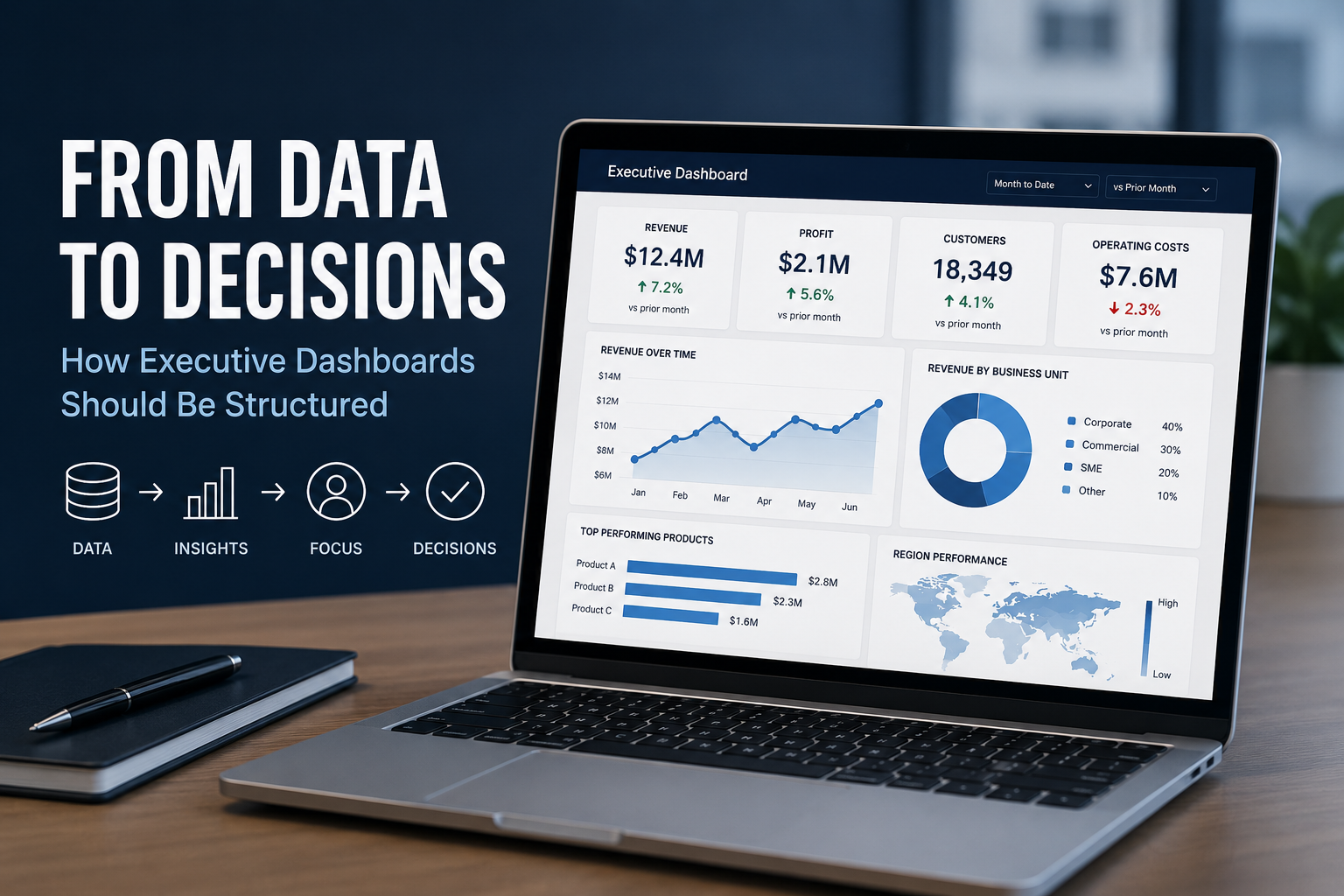
Executives rarely need more data. They need a clearer view of what the data is telling them, what has changed and where their attention is required. That distinction is important when designing an executive dashboard.
Read More
At White Box, we’re passionate about data analysis & visualisation and we like to showcase this through our Data Stories.
Our blog posts cover diverse topics but all have data analysis and visualisation as the backbone to the thoughts and insights we uncover.
Most organisations are not short of data. The challenge is turning that data into something people can trust, access and use when making decisions.
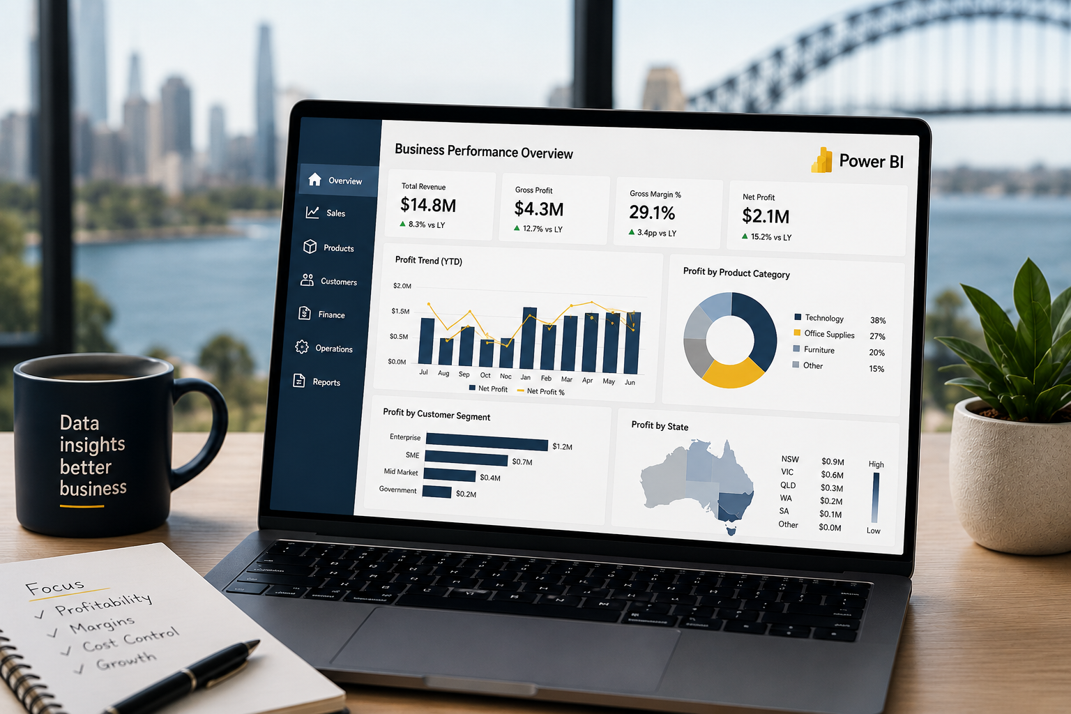
Many Australian businesses face the challenge of turning data into decisions that improve margins, reduce unnecessary costs and uncover opportunities for profitable growth. Microsoft Power BI has become an increasingly valuable part of that process.
Executives rarely need more data. They need a clearer view of what the data is telling them, what has changed and where their attention is required. That distinction is important when designing an executive dashboard.
A common misconception is that businesses need perfectly organised, enterprise-grade data before they can benefit from AI. While strong data foundations certainly improve outcomes, perfection isn't the goal.
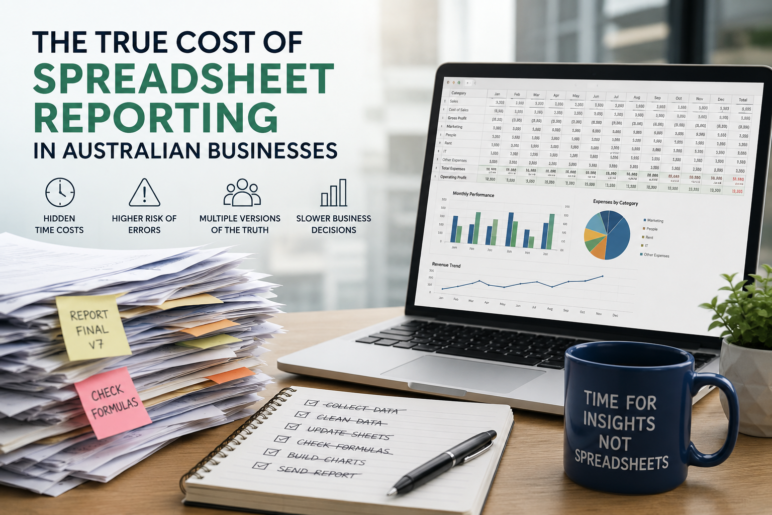
As businesses grow, spreadsheet reporting often becomes an expensive bottleneck that consumes valuable time, increases business risk and limits the ability to make informed decisions.
Learn how to use Power BI parameters to build dynamic, user-friendly dashboards. This guide covers Power Query, field, and what if parameters with practical use cases.
Power BI and Tableau are two of the most popular business intelligence tools, but which one suits your business best? We compare their usability, visualisation, data integration, report sharing, and pricing to help you make an informed choice.
Data storytelling is the art of translating raw data into a meaningful message, helping teams align, make decisions faster, and communicate insights more persuasively.
Look back through our old articles using the search function. Key terms to use are “Power BI”, “Tableau”, “Qlik”, “dashboard” and “Visualisation”.
Executives rarely need more data. They need a clearer view of what the data is telling them, what has changed and where their attention is required. That distinction is important when designing an executive dashboard.
Read More