Bringing imagery to life
What was wrong
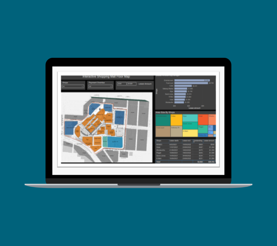
The client lacked a clear understanding of how leaseholds were performing across their commercial retail centre. Traditional reporting methods failed to capture spatial context, limiting strategic insights and decision-making.
What we did
White Box integrated leasehold performance data directly onto interactive floor plans. We created dynamic visuals that mapped spatial and financial data in real time, allowing users to explore and analyse relationships between tenancy and location intuitively.
Why it mattered
The approach provided unprecedented clarity, enabling smarter leasing strategies, improved tenant mix decisions, and better space utilisation—all contributing to enhanced operational efficiency and revenue potential.
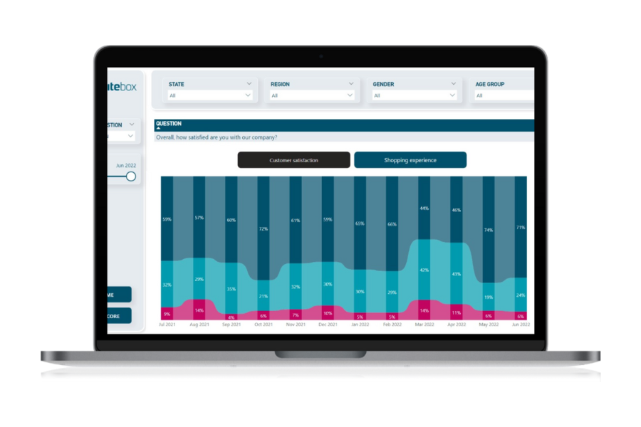
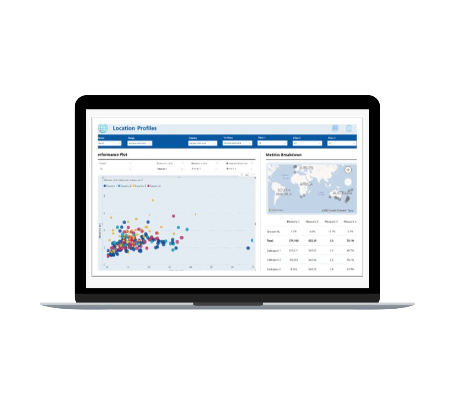
The summary page highlights key questions, answers and trends. These are cherry picked for quick insights and show aggregated or top answers using colour formatting.
The detail page breaks down every question. There are many different ways to visualise this data but after extensive end user testing, our firm favourite is the ribbon chart (right), which represents the trend and changes on responses to each question.
The example here shows a negative swing in customer sentiment in March and April 2022 - probably due to a client price change.

See more of our customer success stories