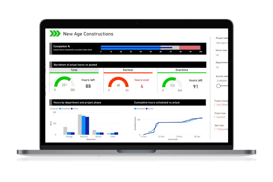
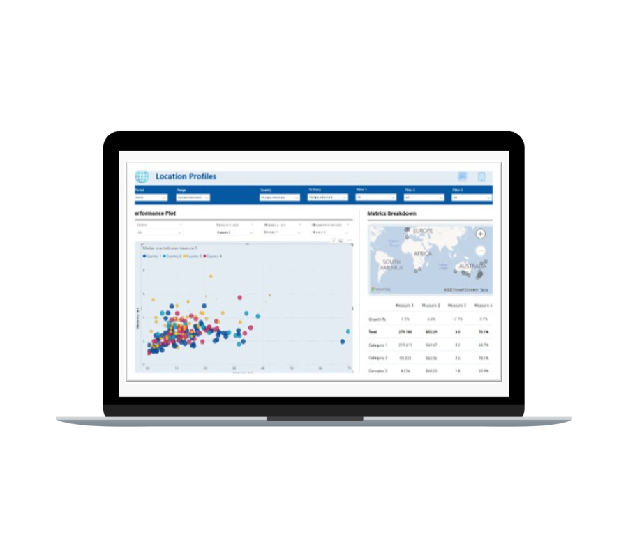
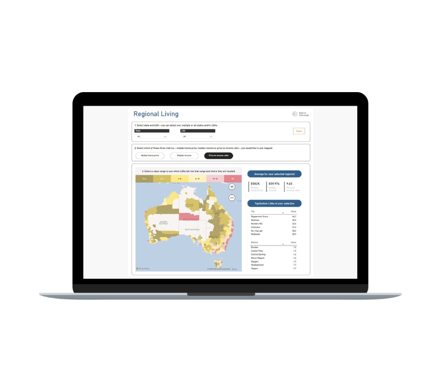
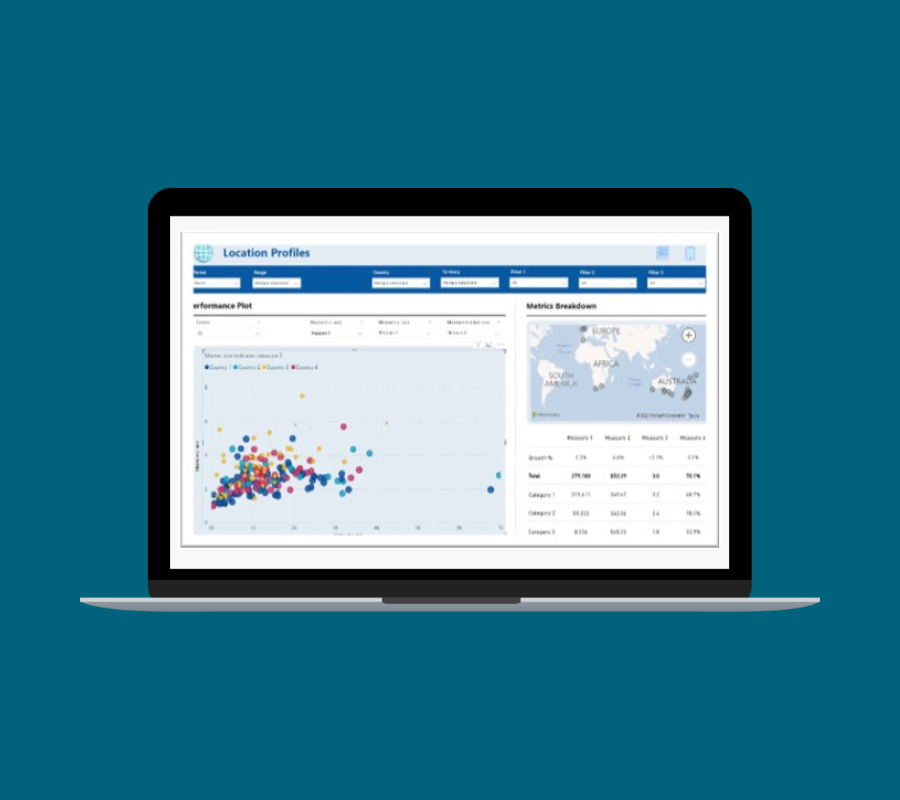
Flexible cuts of data
What was wrong
Our client in the education sector was accustomed to wading through a multitude of charts in order to see relevant metrics but could only make gut feel connections between them.
What we did
White Box created an interactive scatter plot with dynamic axes and variable marker sizes, allowing users to mix and match key performance metrics and visualise how they interacted in a single, unified view.
Why it mattered
The solution revealed clusters of learning centres and patterns that previously went unnoticed. One chart now told many stories, enabling faster, more informed decisions and targeted actions based on real, contextual insights.
The summary page highlights key questions, answers and trends. These are cherry picked for quick insights and show aggregated or top answers using colour formatting.
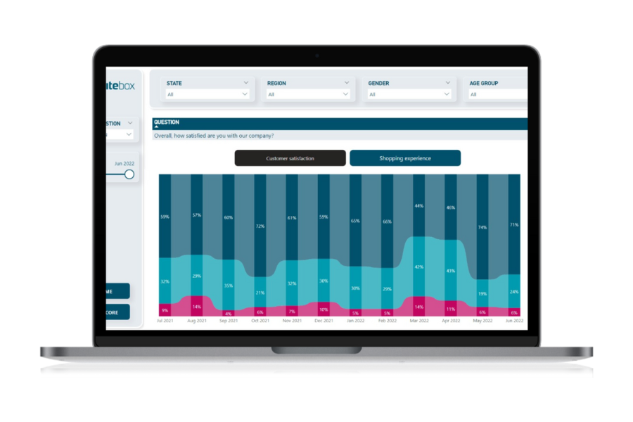
The detail page breaks down every question. There are many different ways to visualise this data but after extensive end user testing, our firm favourite is the ribbon chart (right), which represents the trend and changes on responses to each question.
The example here shows a negative swing in customer sentiment in March and April 2022 - probably due to a client price change.

See more of our customer success stories