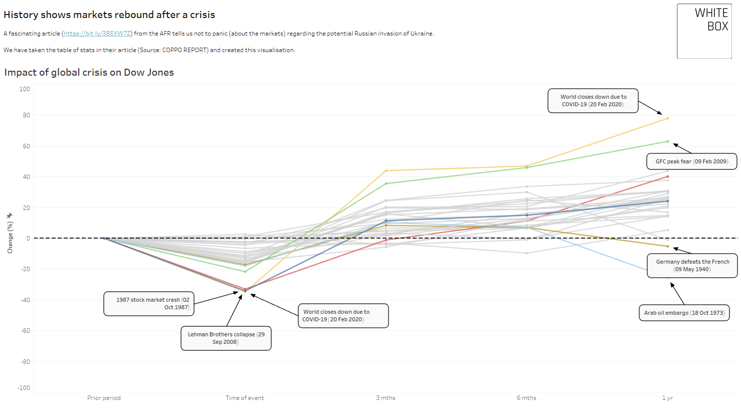
History shows markets rebound after a crisis
One of our core competencies at White Box is being able to turn raw data into something more digestible. So after reading an article on the AFR, we set about doing just that.
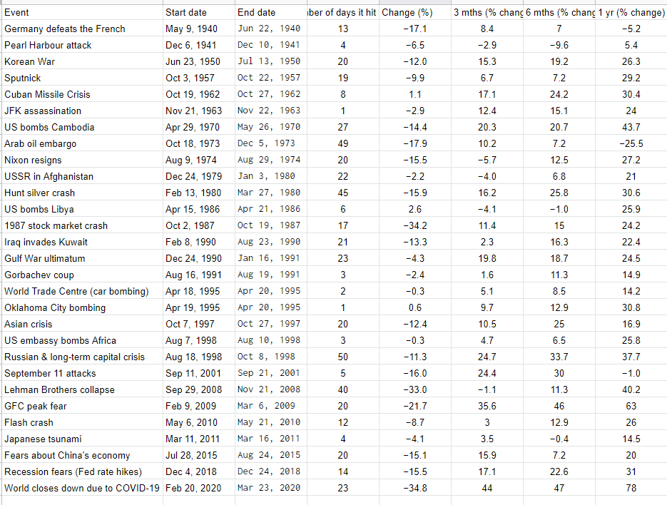
The article describes the threat of Russia invading the Ukraine and the possible impact on the stock market. They looked at the data over the last 80 years of major global events and the impact these had on the markets. A simple table of stats accompanied the text - which is where we jump in.
How can we take cold and clinical numbers and create something engaging?
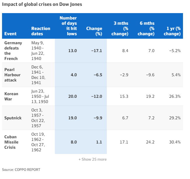
The original table from AFR article
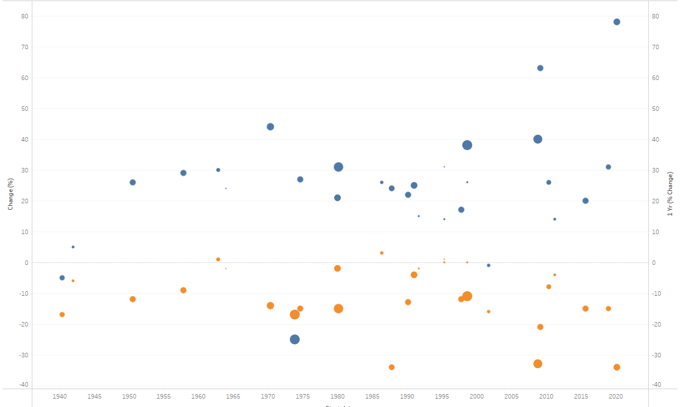
Our version that helps to visualise it
Step 1: Grab the data, which in this case was relatively easy as a copy & paste exercise.
There are many options of where to store this data but given the simple nature and speed required, using Google Sheets was a simple choice and we know it connects to Tableau easily.
Step 2: Apply data transformation to promote consistency, reduce errors, add new columns and generally tidy it up so it makes sense.
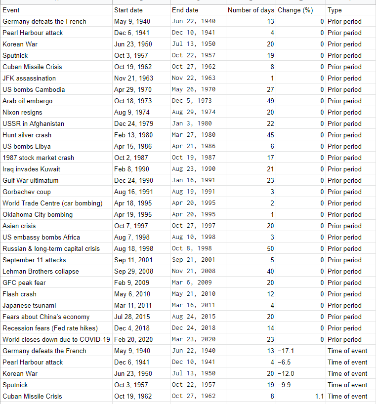
A tidier table of date
Step 3: Make the connection to a reporting tool. Connecting to Tableau is straightforward and we are away at the races doing data visualisation! Or are we?
After spending 20mins looking at different options for visualising, the story wasn’t coming together as planned.
So that means looping back to the data transformation stage.
To make the data work for us, we want long, rather than wide. There are clever ways to unpivot data but with such a small dataset, that isn’t going to be refreshed with new data, it makes more sense to manually change the data. Don’t be afraid of doing things in Excel to prove the data model works. Failing fast is a good methodology for finding the right data model.
Refresh the Tableau data source and the new data is available. Suddenly the story was coming together.
Step 4: Begin fine tuning. Think about it from the readers perspective, rather than patting yourself on the back for having everything in great, interactive detail. For ours, there was too much going, too many colours.
So we move back to the data transformation stage a couple more times to test some ideas and update the naming conventions. This looping process is fairly standard and although these transformations can be done in Tableau, moving up the food chain and dealing with the data at source is always our preferred methodology (although never change the original data, work with a copy).
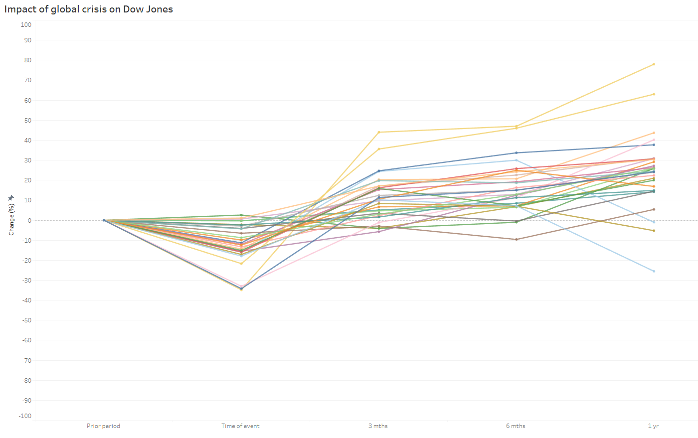
This is what the raw visualisation looks like with too many colours.
To focus the reader on a few key events, we can grey out the remaining ones, overlay a zero dotted line and add annotations to really help highlight our main points.
The final view:

So what are the insights from this chart? Well, of 29 global crisis events, 24 of them rebounded after 3 months, and 26 a year later. Some of the biggest drops seen for the Dow Jones, like the 1987 stock market crash, recovered to be 24% above the previous position a year later.
In summary, if you are a retail investor and you don’t need access to your money straight away, don’t panic too much when things take a sharp drop.
Interested in creating powerful visuals in Tableau? Find out more about our Tableau expertise, or contact us to discuss your data goals.
See more of our posts below: